Here we'll see how DataClassroom can help students produce professional quality graphs from their own data.
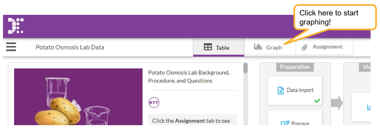
First start by choosing a dataset in our Resource Library or importing your own data.
Then you can go to the Graph tab shown below to prepare your graph.
When you arrive in the graph view, you can click the Show button for each variable to appear on your graph.
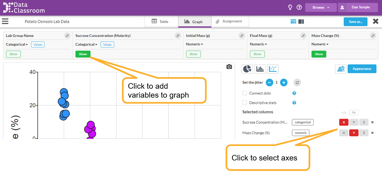
You can use the control panel at the right to change around variables on the axis and add additional visuals to your graph. Options will appear on the control panel as you build your graph.
In the following pages you will find helpful hints on how to do more with your graph like add a title, customize the appearance of your graph and even use DataMojis.
Watch the following video for a quick tutorial on how to get started graphing!
See also
Customizing which controls are shown - if you want to make the interface simpler for your students.
Screen layout controls - how to make the graph fill more of the screen.