Is this the right page for you?
Click on these pages if you are hoping for more information on adding lines of best fit, or other descriptive stats. If you want to fine-tune your graphs appearance, keep reading!
Customizing the appearance of a graph to emphasize an important characteristic of the data or just for fun!
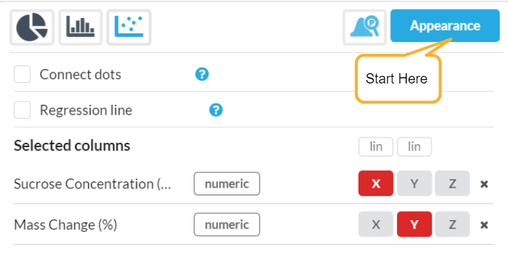
Start by locating the Appearance button on the right side of the screen as shown below.
As you scroll through the list of appearance options, you will find many opportunities to change point colors, outlines, font sizes and much more. Take the default graph and make it your own!
Note:
The type of graph you are viewing will determine which appearance menu presents first -- if you are viewing a histogram, those selections will be at the top, etc. You can find all other appearance menu choices in this one spot, however. Just scroll towards the bottom!
 Default Graph
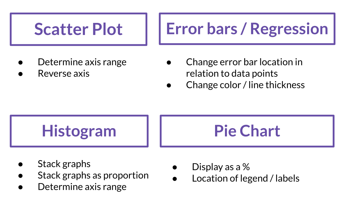
Some features available which go beyond changing colors, datapoint sizes, font type, etc:
Learn more in the following video tutorial: