Who doesn't love a good emoji?  Pictures can help communicate valuable information.
DataClassroom fully supports this practice by enabling students to use DataMojis rather than circular points to represent their data in scatter and dot plots.
Follow the easy steps below to use DataMojis in your graph.
Once you have made an initial graph of your data, click the Appearance button for options to add DataMojis.
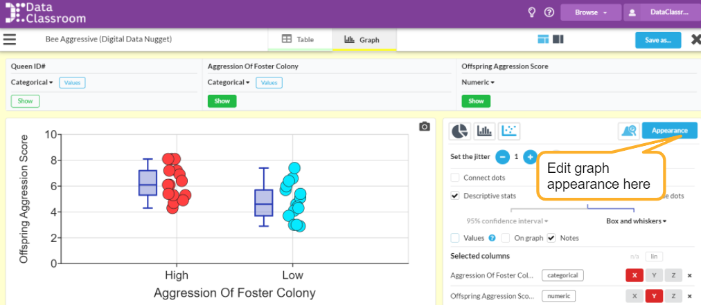

You will see the following options appear in the box on the right of your screen.
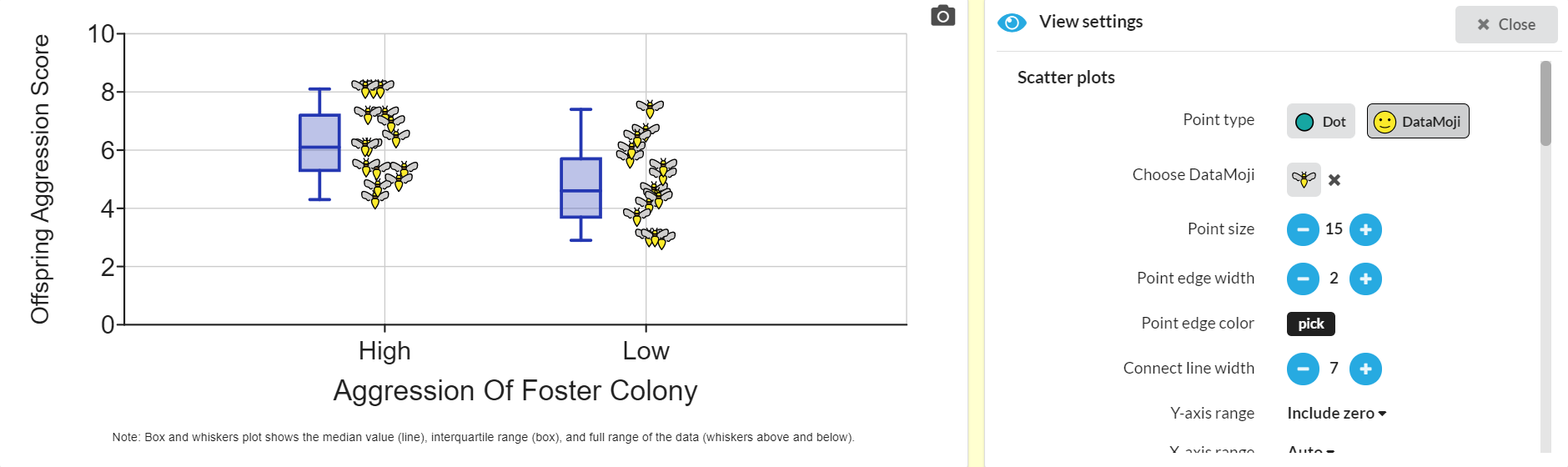
Click on the  button to see a DataMoji replace the dots.
To choose from a library of 3,600 DataMojis, click on the 
You will see a popup window that allows you to search for a  to represent your information.
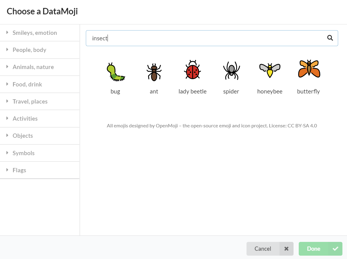
Just click Done and to see your new graph with DataMojis.