In DataClassroom, graph types (see below) are organized based on what kind of visual object the data are shown with, which can be Segments, Rectangles or Dots.
These correspond to the three graph type buttons on the right-hand panel of the Graph view:
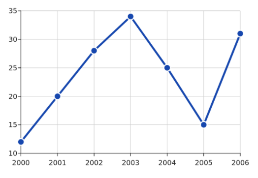
Each of these basic visualization elements can make various graphs, and let's say right away that there are two non-obvious ones, which are (1) the Line Graph which is made of Dots but with connecting lines added:
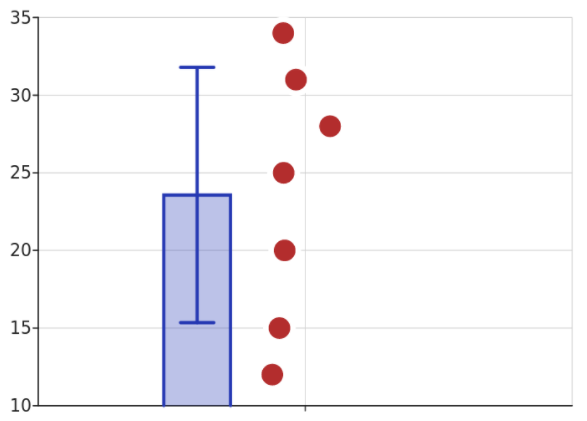
And (2) the "bar graph of the mean" which is done by adding a bar to show the mean to a Dot plot showing the samples. Optionally, you can remove the dots and just leave the mean bar but we don't recommend this as it removes a lot of valuable information from the graph, see this blog post for details.
Graphs based on dots
Dot plot. Note that when we refer to a dot plot, we mean a plot where each sample is shown individually and its position on the Y axis shows its value. Sometimes, the term "dot plot" is used to refer to a frequency plot, where instead of a bar, a stack of dots is shown to indicate the count on the Y axis. Can have descriptive stats (mean/median) added.
Scatter plot. Where a numerical X and Y variable position each dot. Can show a regression line.
Line graph. Based on dots but connected by lines (you can hide the dots), where the Y value is numerical and the X value is some kind of numerical series or list of categories.
Categorical bubble plot. Plotting one or two categories, where the size of the dot represents the number of samples with those values.
Graphs based on rectangles
Frequency plot. Here the X axis is a set of categories, and the Y shows how many samples fell into that category. Sometimes called "bar chart". If you have two categorical variables you can make a grouped frequency plot with multiple bars per X category.
Stacked frequency plot. With the bars stacked on top of each other.
Histogram. The X axis is a set of "bins" into which numerical values are sorted. The Y axis shows how many samples fell into that bin. Can also be grouped by a Z variable to show multiple histograms. Can have descriptive stats (mean/median) added.
Graphs based on segments
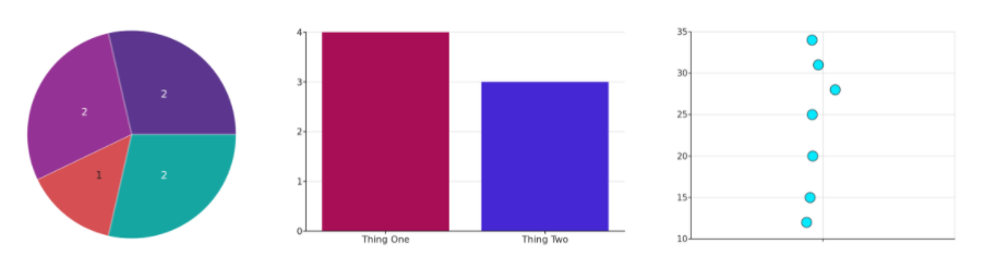
Pie chart, categorical value. Size of the segment shows how many samples had this value. Similar to frequency plot, but good if you want to compare the count to the total size of the population as a proportion.
Pie chart, numerical value. This is similar to the histogram in fact in that the counts show how many values fell into the "bins", but again shown as a proportion of the whole.