Stacking the bars in a frequency (bar) plot can be a helpful way to view your data in a different way. It is especially useful when you are looking at two categorical variables at once and have unequal observations across all values of your categorical variable on X or in situations where you just have a lot of values of your categorical X variable.
How do I stack them?
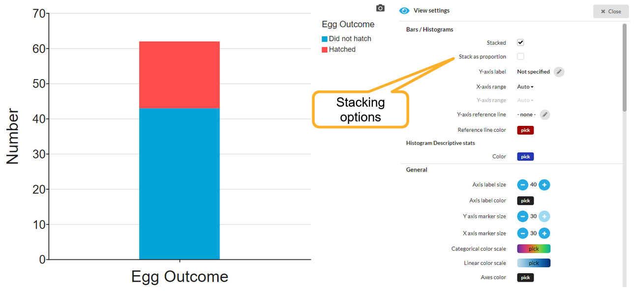
First open the Appearance menu to find the option to stack your bar/frequency plot.
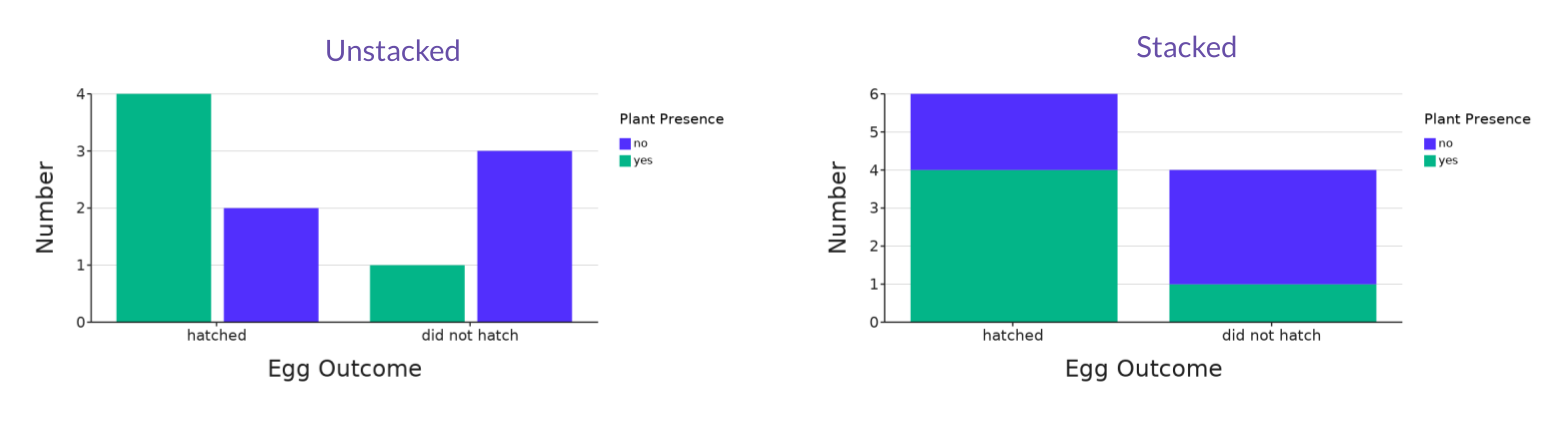
Frequency plots can show the bars side-by-side (default) or you can choose to stack them:
Types of stacked graphs:
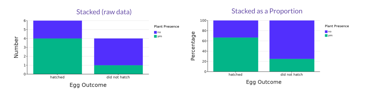
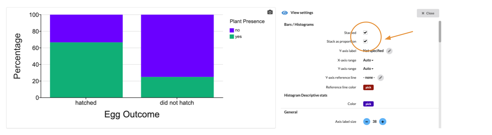
When stacked, you can also choose to Stack as proportion which will make the total height of the bars the same, and present the values as percentages of the total counts: