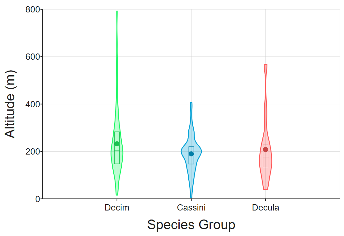
A Violin plot is an alternative to a box-plot or other way to show descriptive statistics for your data.
While traditional charts only display basic summary metrics like medians and ranges, violin plots reveal the exact shape, spread, and probability density of your dataset, making it effortless to compare groups and instantly spot hidden patterns such as multiple peaks, skewness, or outlier clusters in a single visual.
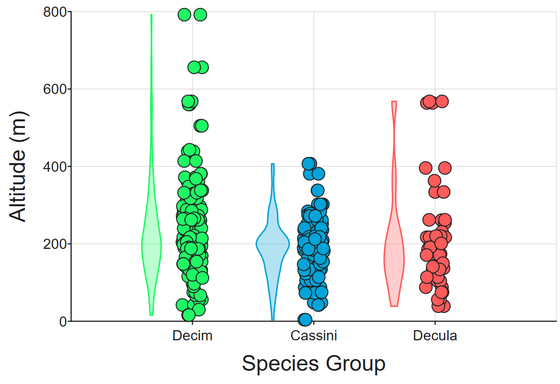
In this example (see it on DataClassroom here), violin plots have been added to supplement the jittered dot plot:
How to add violin annotations
The violin plot is an option to the descriptive statistics feature. It is an alternative to a box-plot (box and whiskers) or a mean-and-error-bars annotation.
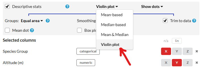
Options for display
You can choose to Hide dots and only show the violin plot itself. There are also options to display a "mini boxplot" or a dot to show the mean within the violin itself:

Here is the result: