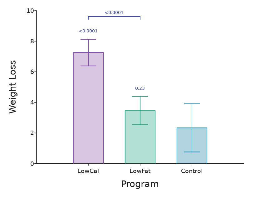
Having run a graph-driven post-hoc test, you will have a table of statistical significance values (p-values), one for each pair of sample groups.
You can place these as annotations on the graph, as shown in the example below (you can also open it on DataClassroom here):
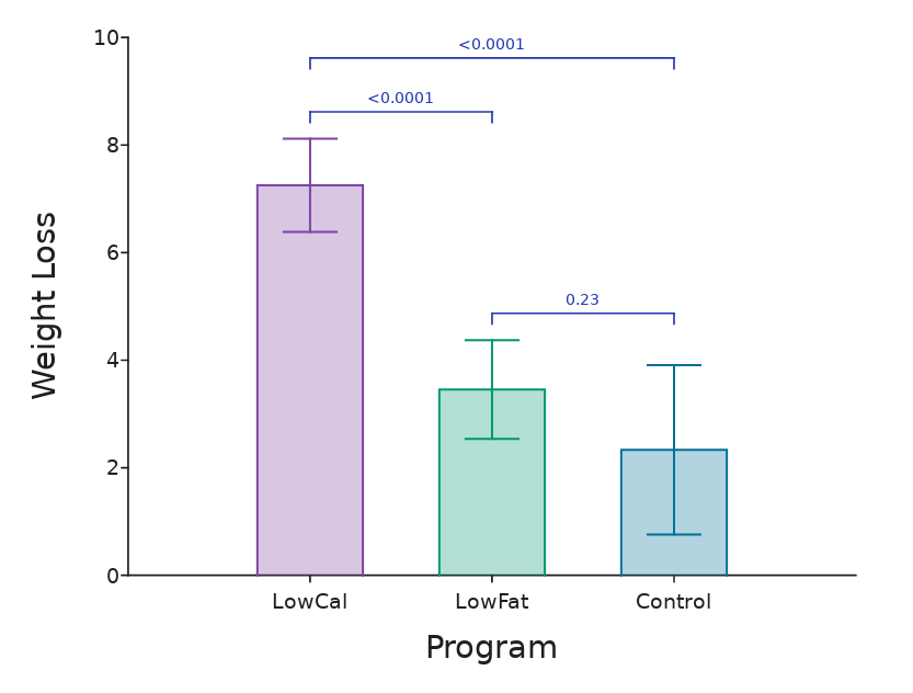
These show that there is high significance between LowCal and Control, and also LowCal and LowFat, but not between LowFat and Control.
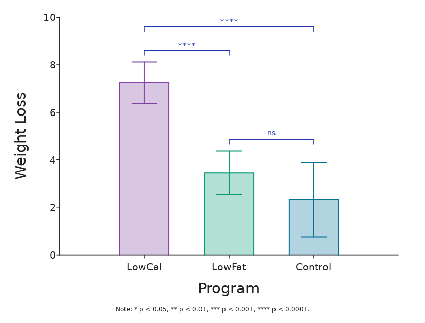
These can also be shown with an asterisk notation as below. 'ns' means "not significant":
How to add them
To add them:
- Run the statistical test, for example in this case ANOVA
- Run the post-hoc test (Tukey)
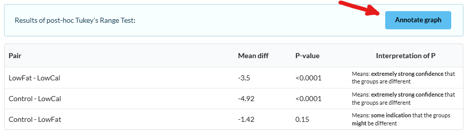
- Click the Annotate graph button
This is above the post-hoc results:
Configuring appearance
You can choose whether to display P values or asterisks, and also select per-pair which annotations to include on the graph (there might be many possible if you have a lot of groups).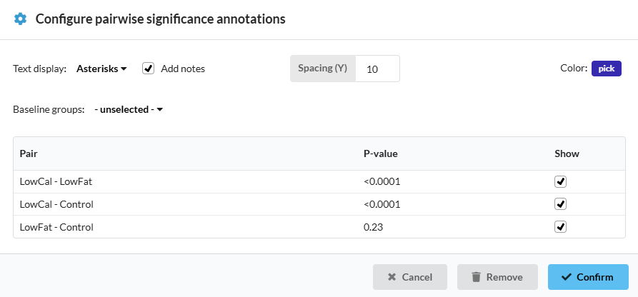
Click Confirm and they will appear on the graph.
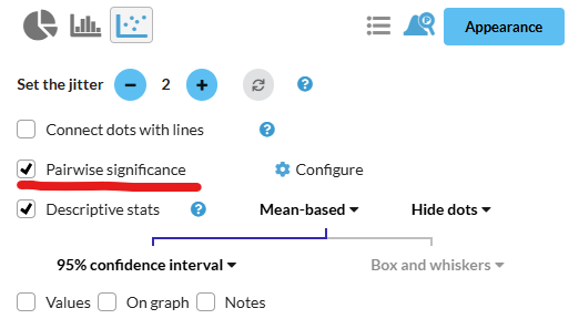
A new control also appears beside the graph, allowing you to re-visit the configuration controls, or remove them:
Choosing baseline group(s)
If one of your groups is a "baseline" group, against which the other groups significance is to be judged, while significance between the other groups is less important, you can set that group as a baseline.
This means that the annotations will appear directly above the groups instead of with the "bracket" which can save space. In this example the Control group has been set as a baseline: