In the Table view of each dataset you will see this flowchart, which is discussed in this blogpost:
This flowchart is "scaffolding" to assist you in getting the most from your data and the tool. It shows the typical steps in working with data.
You don't have to follow these steps as it is only for guidance, but you should pay attention to any warnings that are showing, like this.

Click on the box to see which warnings are being shown. You can choose to fix them (for example, you will get a warning if your column headers are numbers, as this might indicate that your first row of data has ended up as a heading) or you can also click Ignore and the warnings will be hidden.
Each check also has a handy link to an Explainer that explains in more detail what is being recommended. These can also be useful, even if there are no warnings.

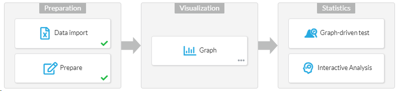
The steps
Here's what they do:
- Data Import. Importing data and checks on whether the format looks OK. Here you can also see where your data came from and reload data that was sourced from Google Drive.
- Prepare. Things like setting your column data types, filling out a description, and so on.
- Graph. This "step" just encourages you to visualize your data before going forward, which you'll need to go to the Graph tab to do. Here you can also open the Graph Wizard.
- Graph-driven test. Once you have graphed your data, you can move on to performing a statistical test (a hypothesis test) here.
- Interactive Analysis. These Analyses are detailed step-by-step walkthroughs of the math inside the most common statistical tests, to give you an understanding of what is actually involved.