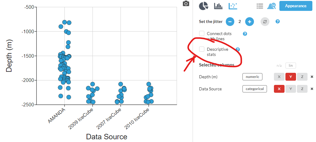
Once you have created a dot plot or a histogram, it is a simple task to add visuals to show descriptive statistics like mean and median, with or without error bars. In any dataset that has a numeric Y axis and a categorical X axis, the 'Descriptive stats' option will appear in the box to the right of your graph. Begin your selection by checking that box.
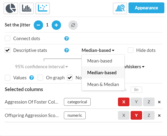
Once you have checked the box, several options will appear. You will have the choice of showing mean, median or both.
For Median-based statistics you will see a drop down menu for box and whiskers (aka boxplot) or the median line.
For Mean-based statistics you will see a drop down menu for the measure of uncertainty to display: standard deviation, standard error of the mean (SEM), SEM x 2, or the 95% confidence interval (CI95). Also offered are Half Range (aka Semi Range) and Mean Deviation error bars.
You may also choose to show both Mean & Median on your graph. You will have access to all choices for both categories
Once you select your choices, you will see the visuals appear on your graph.
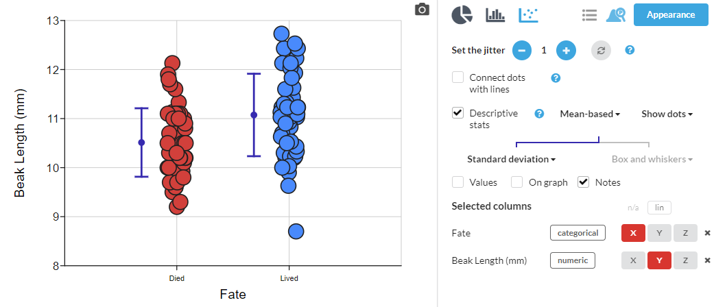
You also have the option to show the values on your graph or in the window just by checking the Values box. This will show a table of the numerical values for mean, median, 95% confidence interval, and so on.
Highlighting outliers can also be done: in this case, the descriptive stats annotation is shown (boxplot or mean/error bars) and just the data points that a calculated to be outliers. See the outliers article for more detail.
Grouping by a numeric X variable
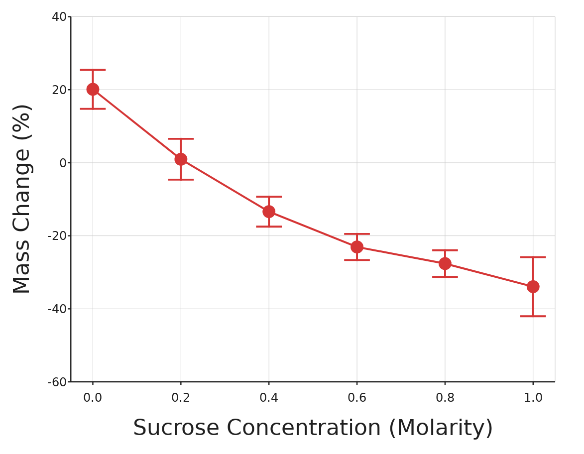
You can display descriptive statistics for groups of points when your X variable is numeric, as long as the values fall into groups rather like those of a categorical variable. This lets your graph have a proper numeric X axis. Sometimes these kinds of error bars are called per datum error bars.
Note that the descriptive stats will in this case always be above the numeric location on the X axis (overlaid on the dots) so it can often be the case that you might want to use the "Hide dots" option, or reduce them in size.
You can play with this example dataset here.
Usually if your data is suitable for grouping in this way the option will just appear, so you don't have to think too carefully about exactly when your data will be considered "grouped". However, you'll need to have data which has:
- At least two different values, with at least two points with each
- Few X values that are "loners" i.e. no others with same value
Video tutorial
Watch the tutorial below for more assistance adding descriptive statistics to your graphs.