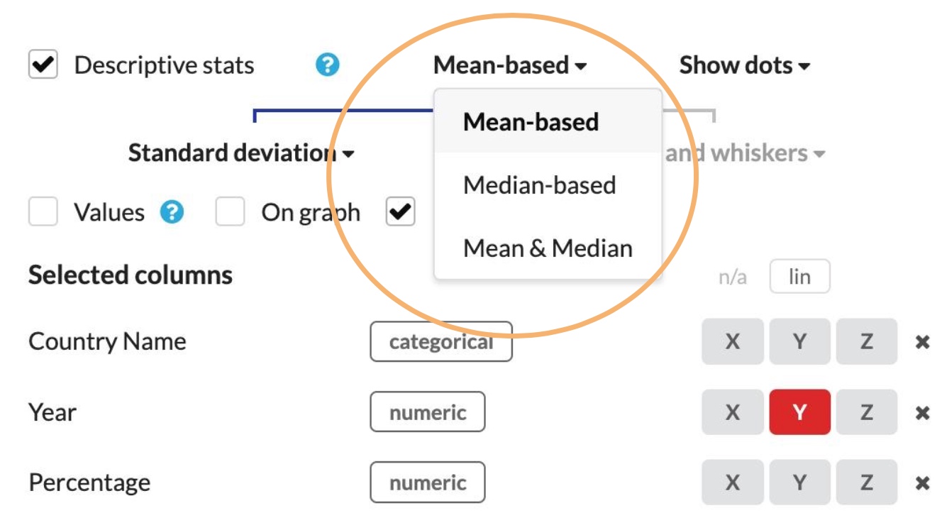
Which type of error bars/descriptive stats do you need?
Standard Deviation (SD)

What does it tell you?
Standard deviation shows us the distance from the mean for a “typical” data point.
A low SD means less variability or variation in the data while high SD indicates more spread out data. The SD can be used to make inferences based on the premise that what is true for a randomly selected sample will be true, more or less, for the population from which the sample is chosen.
Standard deviation is a property of the population or thing being measured and will not get dramatically smaller even when you increase sample size a lot.
What is it?
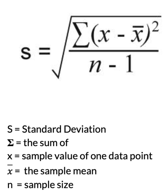
Standard deviation is the square root of the sum of differences between each data point and the mean squared, divided by the sample size minus one.
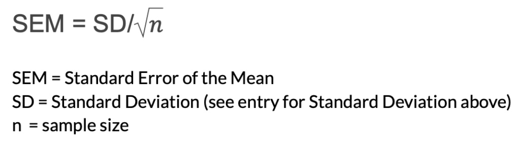
Standard Error of Mean (SEM)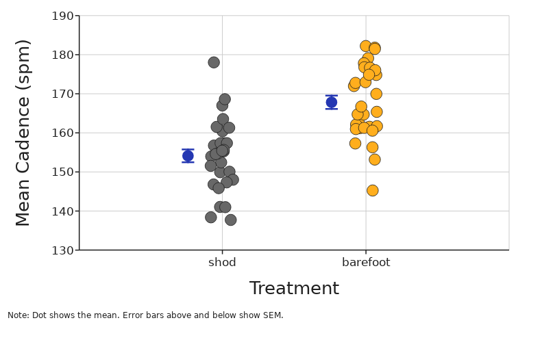
What does it tell you?
SEM tells you how far your sample mean is likely to be from the true population mean.
Essentially this is a prediction of how far from your calculated mean the mean of another random sampling of data would be. In a sense it is a way to evaluate how strong your estimate of the mean is given the variation of your data around that mean. You could say that it is a way of estimating the precision of your estimate for the mean.
Because sample size is in the denominator of the equation for SEM, the standard error of the mean will become smaller as sample size gets larger. That makes sense because as you collect more data you should be able to get a better estimate of the true mean of the variable of interest in your study population.
What is it?
Standard Error of the Mean is the Standard Deviation divided by the square root of the sample size.
95% Confidence Interval (CI)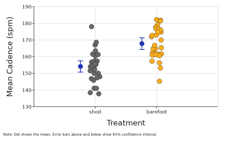
What does it tell you?
The 95% confidence interval can loosely be interpreted as the range that has a 95% chance of containing the true mean.
A more technically correct meaning is that it tells you that if you were to repeat the experiment many times, we would expect 95% of those confidence intervals to contain the true mean.
What is it?
95% confidence intervals are placed above and below the sample mean and have the value of 1.96 times the standard deviation divided by the sample size.
That 1.96 value is determined by your cutoff for statistical significance (alpha level). With a 0.05 cutoff the value is 1.96.
Semi-Range.png)
What does it tell you?
The semi-range is often used in IB physics as a simplistic measurement of dispersion of data. It tells you the general uncertainty in repeated data.
Semi-range is only concerned with extremes in data, not all the data between.
It shows you a measure of the total range of values for the measured variable.
.
What is it?
(Largest Value - Smallest Value) / 2 = Semi Range.
The value of semi-range is displayed by adding and subtracting from the mean value.
Mean Deviation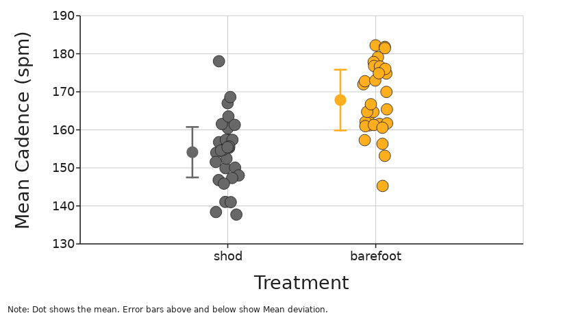
What does it tell you?
The mean deviation tells you the average distance from the mean for your data points.
Small mean deviation indicates that data is close together with low variation.
Large mean deviation indicates that data is spread out with high variation.
.
What is it?
Mean deviation is defined as:
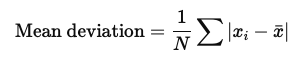
It can be calculated by first, calculating the mean, then finding how far each data point is from the mean. The average of these values (the distance from the mean) is the mean deviation.
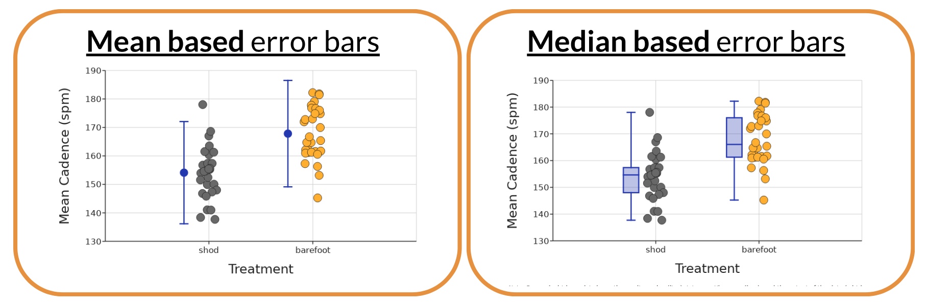
 Box and Whisker
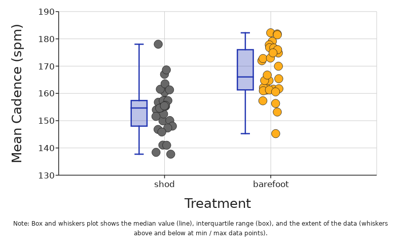
What does it tell you?
Box and Whisker plot visually summarizes the overall shape and spread of the data. It clearly highlights the median and shows where the middle 50% of the data are.
The box itself shows exactly where the middle 50% of the data are. This is often referred to as the interquartile range (IQR) and it goes from the 25th percentile (quartile 1) to the 75th percentile (quartile 3). The line that divides the box into two parts is the median value in the data. The whiskers above and below the box can show a few different things. The default in DataClassroom is to have the whiskers show the full range from the highest value to the lowest value in the data. If you choose to show outliers, then the whiskers will show either (depending on your choice) a value of 1.5 times the interquartile range (IQR) or two standard deviations above and below the mean.
What is it?
The line in the middle is the median. The box is the middle 50% of the data and the whiskers are (usually) showing the highest and lowest values. Sometimes the whiskers show something else like 1.5 times the IQR.
The median is not a calculation of the average (mean) of data, but rather if all data is sorted in order, it is the middle value. If there is an even number of data points, then the median is the calculated average between the two most middle values of data. The 25th and 75th percentiles make up the upper and lower edges of the box. They are the medians of the upper and lower halves of the data.
Median Line
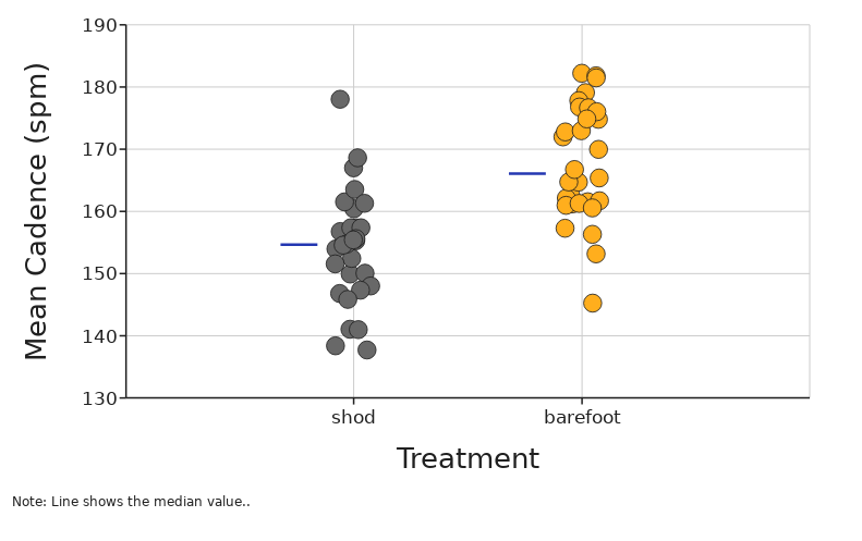
What does it tell you?
The median line tells you exactly where the middle value in your data is.
What is it?
The median is the middle value of your data.
This is not a calculation of the average (mean) of data, but rather if all data is sorted in order, it is the middle value. If there is an even number of data points, then the median is the calculated average between the two most middle values of data.