Descriptive statistics are a summary of a collection of information or sample of a larger population. Mean and Median are familiar descriptive statistics that can be used to determine simple characteristics of a sample. Error bars show characteristics of the variance.
DataClassroom provides an in-app tool to select the use of descriptive statistics when graphs have a numeric Y axis.
Two examples of this type of graph are shown below:
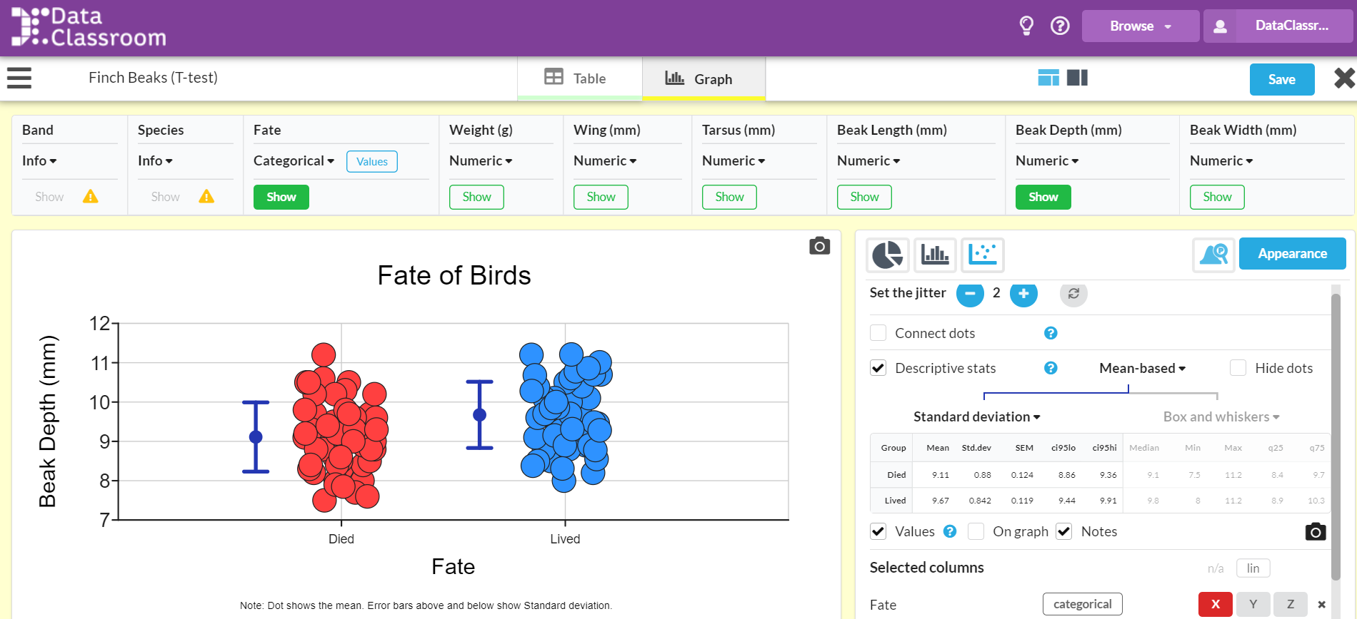
With the first example it is easy to see that the X axis shows a categorical value of the fate of the Galapagos Finches. You can see in this screen shot that the 'Fate' column in the table has been labeled as 'Categorical'. You can also see that the 'Descriptive stats' box has been check and 'Mean-based' has been selected. With these selections a representation of the mean as a dot and the standard deviation with a line appears on the graph. You can also see the values for the calculations so that students may confirm their own work.
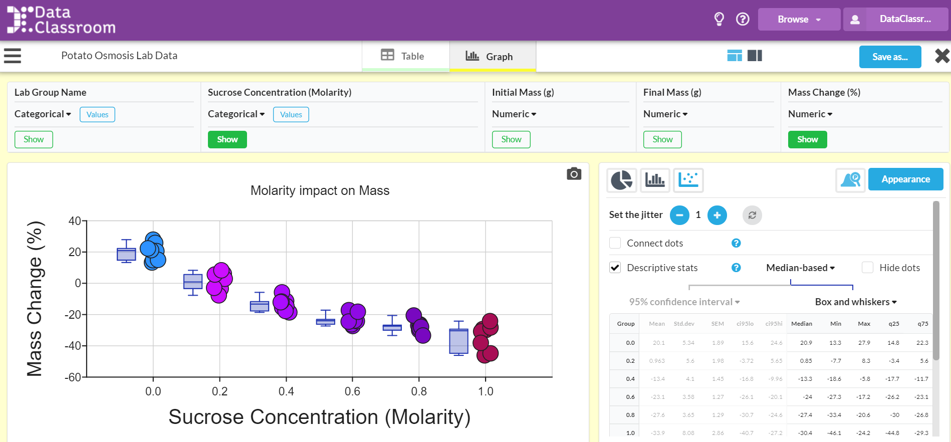
In the second example, Sucrose Concentration(Molarity) is selected as category rather than a numeric value. You can also see that Median-based statistics shown with box and whiskers and another option for showing descriptive statistics for your data.
There are several options for each category of descriptive statistics:
For Median-based statistics you can chose from box and whiskers or the median line.
For Mean-based statistics you you can chose from the following for your error bars:
- Standard deviation or 2 x standard deviation
- SEM (standard error of the mean) or 2 x SEM
- 95% confidence interval
- Semi range (half the total range of values)
- Mean deviation
- Entered values - these are values you enter yourself.
For the entered values you have the option of specifying one common value (for example the precision of a measurement), or different values for each group of samples. You can also specify different values for the upper and lower error bars.
You may also choose to show both Mean & Median on your graph.
To learn the steps for adding visuals for descriptive statistics on your graphs click here.