If you are looking for comparing error bar types, check out the Which error bar? When? page. Below, find all you need to know about Box and Whiskers and how to add them in DataClassroom
Box and Whisker - What does it tell you?
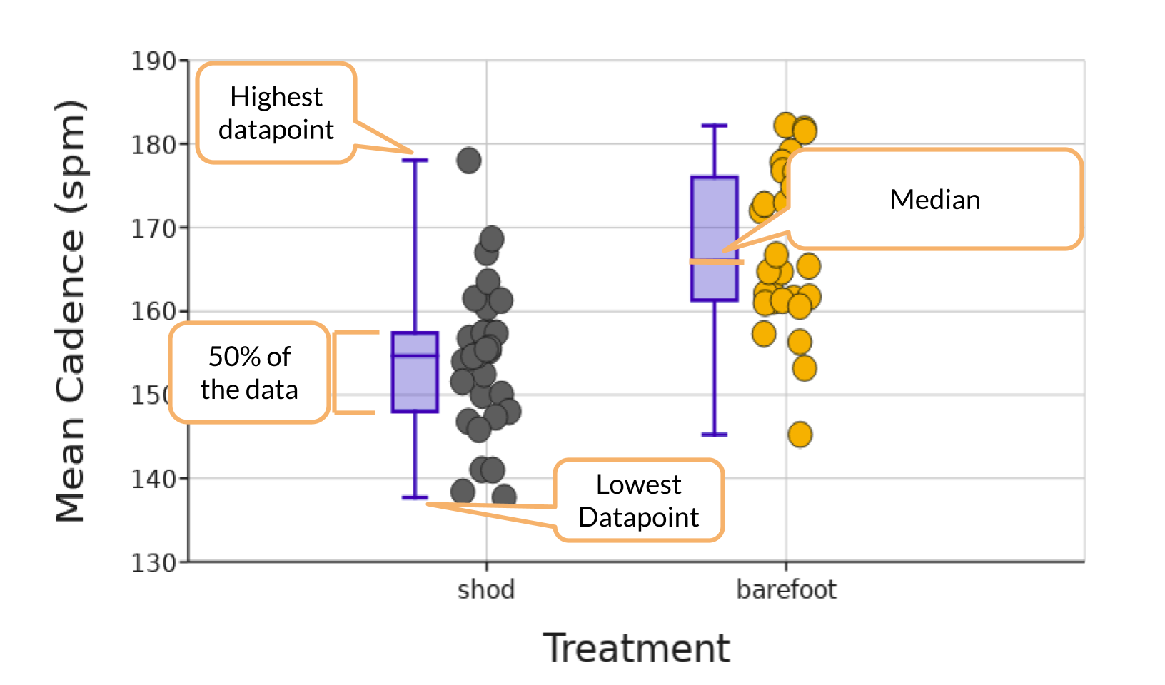
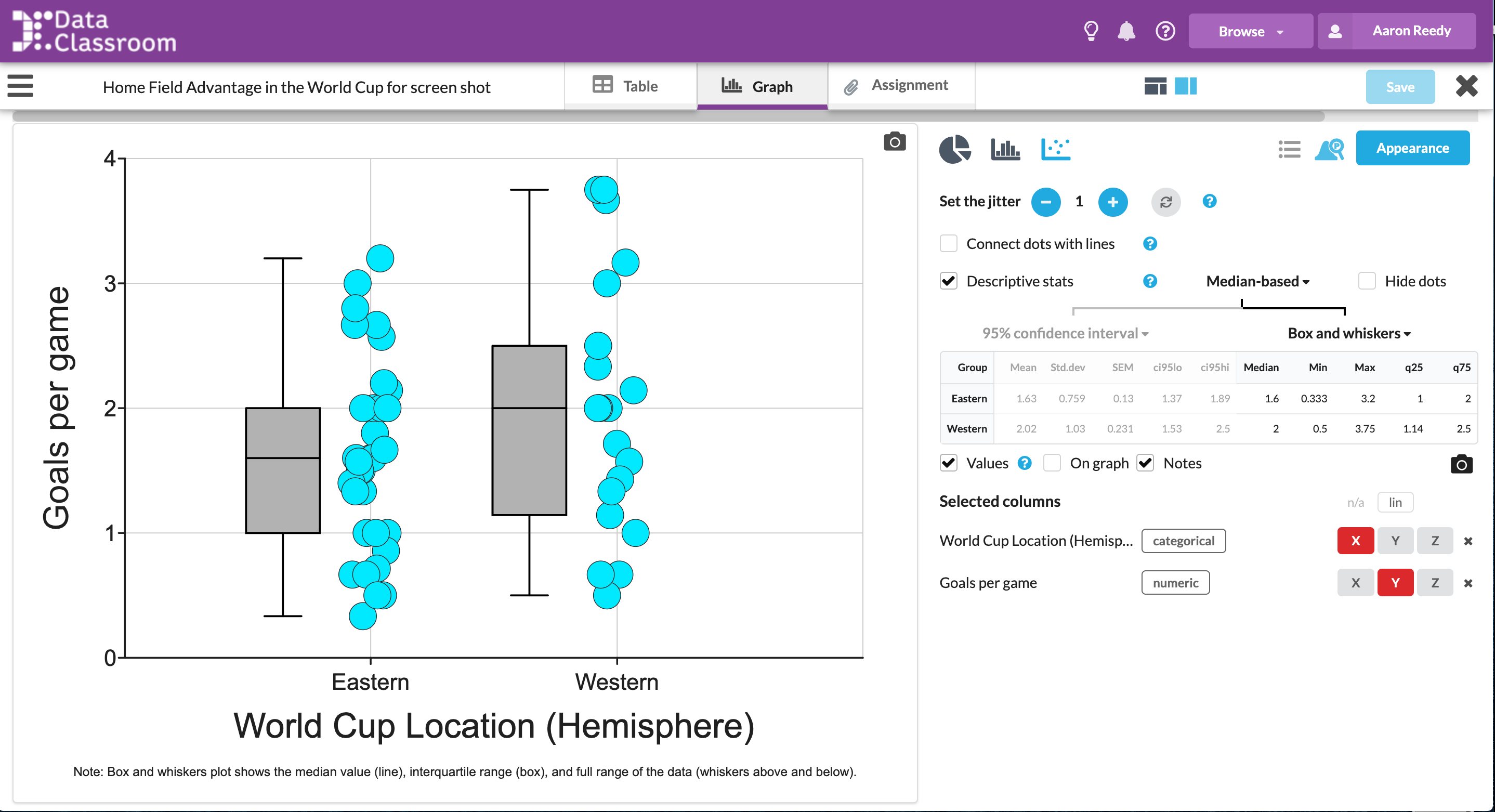
Box and Whisker plot visually summarizes the overall shape and spread of the data. It clearly highlights the median and shows where the middle 50% of the data are.
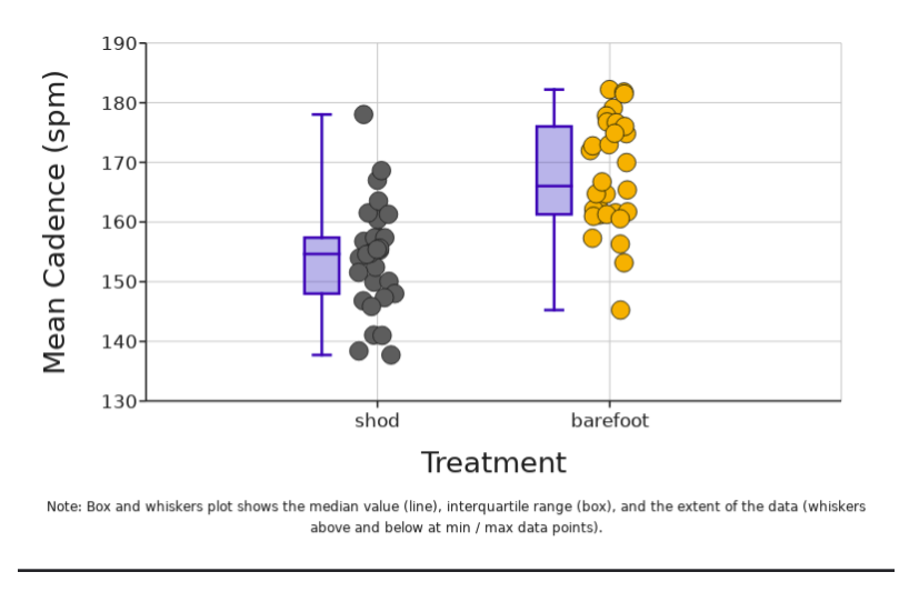
The box itself shows exactly where the middle 50% of the data are. This is often referred to as the interquartile range (IQR) and it goes from the 25th percentile (quartile 1) to the 75th percentile (quartile 3). The line that divides the box into two parts is the median value in the data. The whiskers above and below the box can show a few different things. The default in DataClassroom is to have the whiskers show the full range from the highest value to the lowest value in the data. If you choose to show outliers, then the whiskers will show either (depending on your choice) a value of 1.5 times the interquartile range (IQR) or two standard deviations above and below the mean.
What is it?
The line in the middle is the median. The box is the middle 50% of the data and the whiskers are (usually) showing the highest and lowest values. Sometimes the whiskers show something else like 1.5 times the IQR.
How do I add them?
In DataClassroom, it is as easy as checking a box to show these valuable descriptive statistic visualizations. The values for these calculations are also shown so students can learn how to use the statistical tools to process their data and confirm their work.
For more information on adding visuals for descriptive statistics, you can either see our tutorial page here or watch the tutorial video below.