The Z axis allows you to add information from an additional variable to the graph, either:
- Adding color (either shading by a numerical value in Z, or coloring by a category of Z)
- Grouping the samples according to a category of Z. (see here)
(Sorry, it doesn't make a 3D graph. Yet.)
Adding more information by using a z variable:
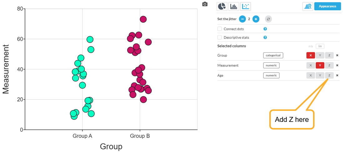
Here is a simple example of a scatter plot, where a numerical Measurement on the Y axis is divided up into two groups on the X axis.
Let's say there was a third, numerical variable (column), Age, and we want to see how it relates to the other two. Add it (Age) as a Z variable:
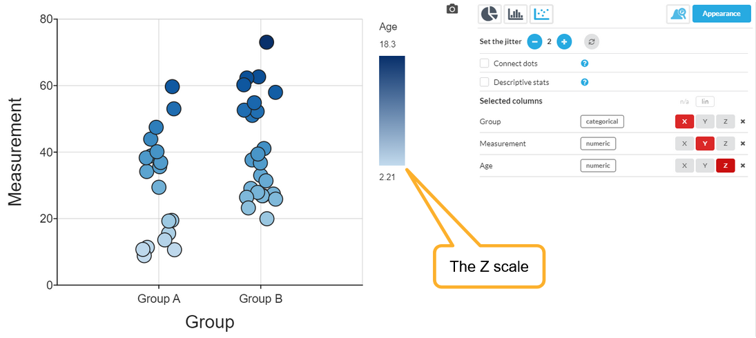
Here is the result. In this case, you can clearly now see that Age and the Measurement are correlated:
A couple of things to note:
- The Z variable is now controlling the color, so the coloring due to the X group has been removed.
- The Z variable was numeric, so the color applied is a linear shading.
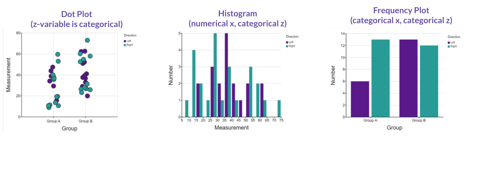
Other ways a z-axis variable can enhance your graph:
Need even more details?
See also
Change the color scheme: Visualizing Z variable using color
Add a regression line: Multiple Lines using a Z variable
Separate the values for clearer evaluation: Grouping dots by a Z variable