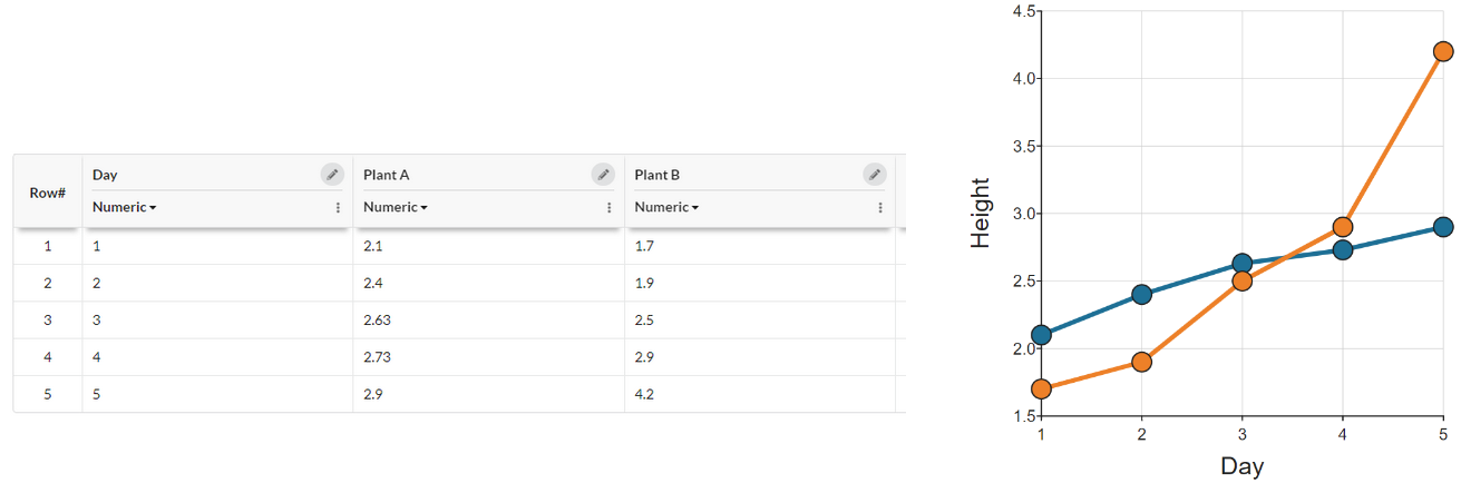
This article is for you if you have some data that looks like that on the left, and you want a graph like that on the right - i.e. you want to have two sets of data on one graph:

You have two colums of data, and you want to plot as two lines. You may have found yourself wishing for a second Y axis. Well in this case you don't in fact need multiple Y axes, as both your columns are measuring the same variable (height). (You can see this dataset here, by the way).
The way to do this in DataClassroom is to reorganize your data so your multiple columns of data become two columns, each representing a different variable:
- One column (or variable) that says which subject the row of data is "about". In this case, Plant A or Plant B. This might be called "Plant ID" and should be a Categorical variable.
- One numeric column that contains the thing being measured with numbers. This might be called "Height" and is a Numeric variable.
Your table should start something like this (not all rows are shown):

You will of course then have twice as many rows. But you can then graph your data by putting Height on the Y axis, and using Plant ID as a Z variable which splits the data into two groups. (You can open the modified dataset in DataClassroom here)

Why is it like this?
You may be thinking this is a lot of bother to go through, when the data are really just the same. And indeed there was nothing "wrong" with the original table.
Well, now you have organized the data so you have two clearly named variables, i.e. Plant ID and Height. This is a really valuable practice when going forward to doing any analysis of the data, whether in DataClassroom or any other tool. This is the way that the pros most often do it in the real world.
Notice that if you had had three plants, you'd still only have had the same two variables (and two columns), you'd just have had three possible values under Plant ID.
This way of formatting data is called Tidy Data, and we have a more detailed article on it here. Have a look under Working with data for more related tips and tricks.