When dealing with only one numeric variable, it can be hard to see all your datapoints:
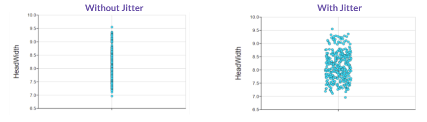
By default, DataClassroom will display it as a jittered dot plot, spreading your data at random along the un-numbered axis.
This way you can better view how your data is distributed.
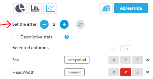
Change the Jitter:
Depending on how many data points you have, and how big you make them (you can adjust the size under the Appearance menu) you might want more or less jitter, so you can control this using the Set the jitter control on the right of the graph:
Jitter with more than one value of a Categorical Variable :
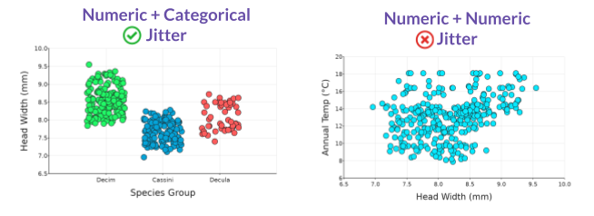
Adding a categorical variable on X still allows you to work with jitter, should you choose. This is because there is no numeric value associated with moving a datapoint horizontally along the X axis. However, if you add another numeric variable, it locks the datapoint into a specific spot on the X axis and jitter is no longer available.
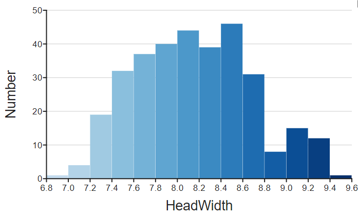
Too many points?
If you have so many data points that your dot plot really doesn't help you see the distribution, try a Histogram instead. The histogram can be found under graphs made with rectangles. This can give another view of the distribution: