A density plot shows a curve indicating how densely data points are distributed along an axis. It can be an alternative to a histogram or a violin plot.
These two plots are made with the same raw data (distribution of cicadas with altitude, see example dataset here):
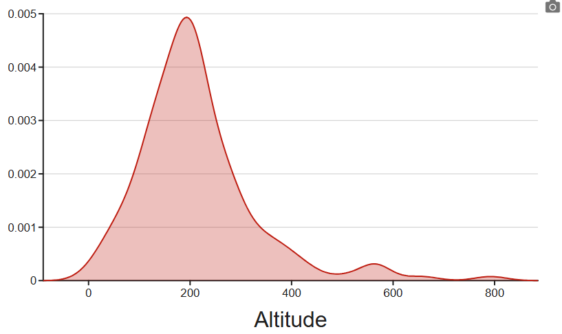
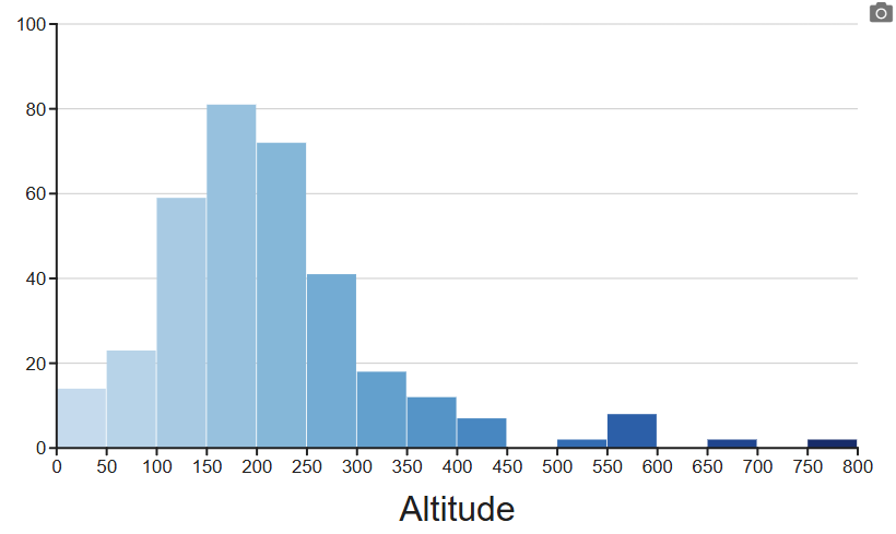
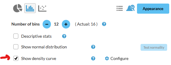
To display the density curve instead of the histogram, click Show density curve:
Multiple curves (by group)
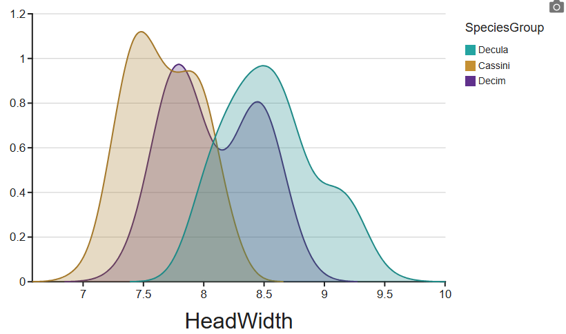
If you had a Z axis on your histogram that had grouped and colored the data, the same will be carried over to the density plot. Here are the same cicadas, showing how their head width (size) is grouped by species. (see example dataset here):
Ridgeline plot
By default, all curves are drawn on top of each other and are semi-transparent. Clicking the Configure (gear icon) allows you to displace the curves so they show as a series of "ridges":
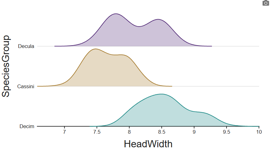
You can also adjust the ridge offsets, so they are partially overlaid, and adjust the opacity for a different look:
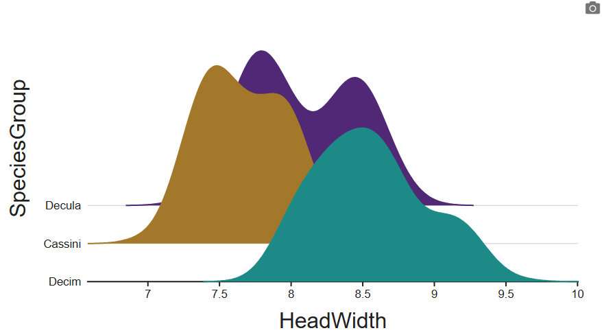
Configuration of the curves
There are number of other options you can play with, depending on your data and how you want to present it.
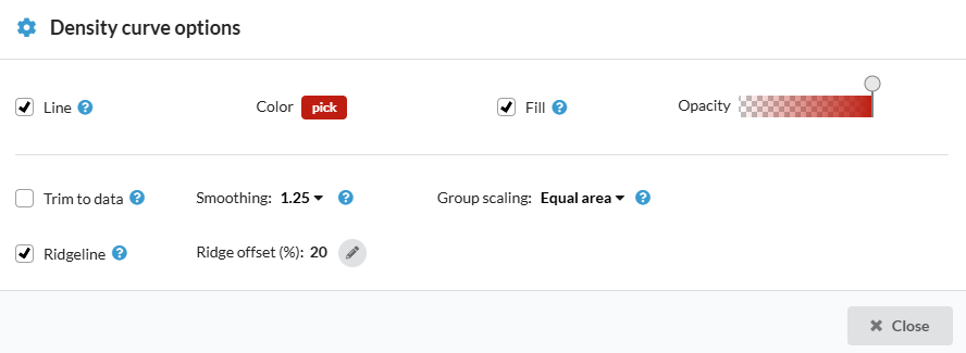
Note: the color setting only takes effect when you don't have groups. Otherwise, the per-group color (set in the categorical variable's Values configuration) takes precedence.
Line and fill control whether the outline and/or the filled are a shown.
Smoothing affects how smooth the curve looks, and is similar to playing with the histogram's number of bins.
Trim to data removes the "tails" on the left and right, and stops the plot exactly where the last actual data points are on each side.
Group scaling affects the relative heights of the curves when there are groups. Equal area is usually the best choice when the values for each data point are directly comparable, but equal width can be used when you want them all to have the same maximum height.