When presenting data visually, color can be very illustrative of the parameter your data represents. Or it can help the viewer to see a pattern.
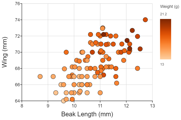
DataClassroom offers a choice of color scales that can automatically assign colors depending on the value of:
- A categorical variable (a set of colors picked from points along a scale)
- A numeric variable (a scale that smoothly goes from one value to another)
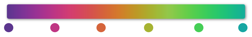
For example, our default color scale for categorical variables is this one. Here you can see what colors would be chosen from the scale if a variable had 5 possible values:
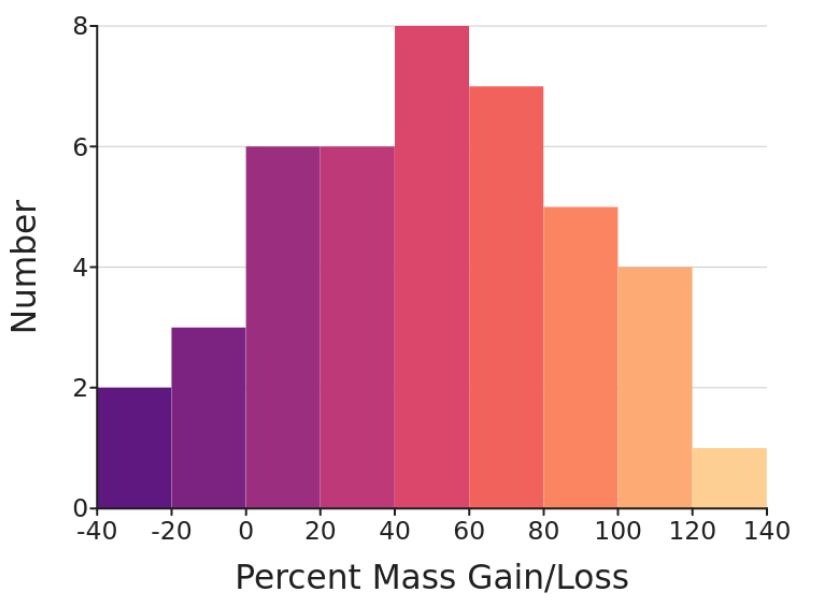
And for numerical variables, it's this one:

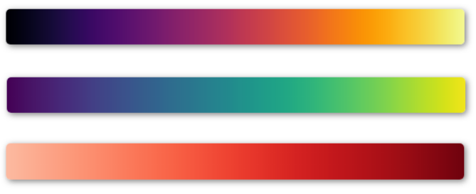
Choosing alternative scales
If you get tired of the ones above, you can choose other scales from a long list of possibilities. Here are just some examples:
To pick a new scale, look under the Appearance menu on the graph controls, and find the color scale controls under the General section:
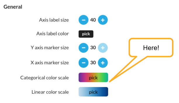
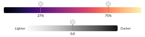
You can pick a scale from the (long) list of standard scales, and once you have chosen one, apply "tweaks" such as picking just part of a scale, or making it look lighter or darker.
The controls look like this:
More on color scales
You will see that some of our standard scales already have some tweaks in that we avoid going "all the way to white" at one end of the single-color scales, and also that for the cyclical scales, we don't use the full length as there is the same color at each end of the scale.
Some color scales are designed for viewers with color blindness / vision deficiency, for example there is one called Cividis (see this article for much detail on such colormaps).
The Turbo color scale has been designed so that the perceived lightness is very smooth, while retaining good perception for vision deficiencies (see this detailed article by the designer).