Let's say you are running an experiment to see how light affects plant growth. You will expose plants to either light or dark environments, and measure their growth after a week. You have three volunteers, Ali, Beth and Cy who will each manage a pair of plants. So six plants in all. Back to overview...
Entering your results like this (you can view this example in DataClassroom here):

This is just how we'd recommend you do it! This is an example of Tidy Data (read more here) where you have one sample per row, and a column for each of your variables.
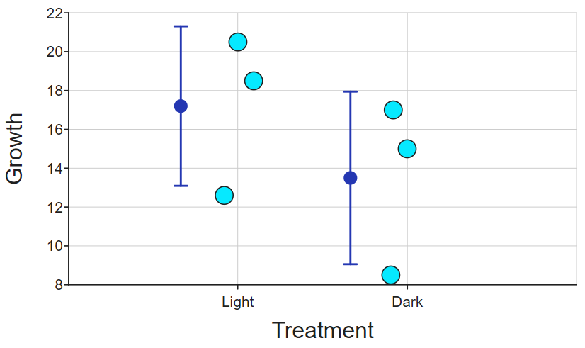
This means that DataClassroom can display every data point on a Dot Plot, and also display any other measurements like average (mean), etc., for example:

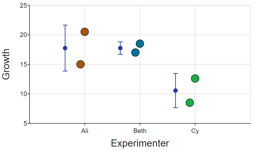
The dot-and-whiskers display the mean (and standard deviation) of each group. You can see how the data are distributed depending on the treatment. But you could also choose to show the data by experimenter:

This reveals something more interesting, namely that it appears that Cy's plants are growing quite a bit less than the others. Maybe something that could be investigated there?
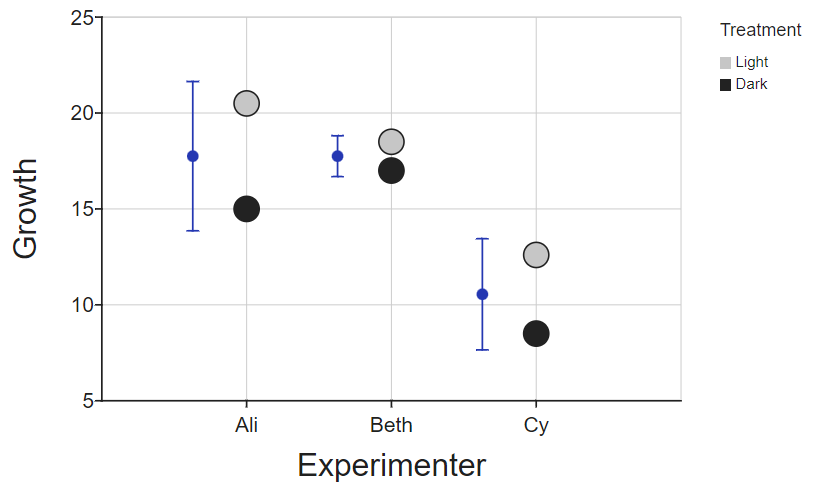
Another option, as we have two variables here (experimenter and treatment) is to display them grouped by one, but colored by another, using a 'Z axis':

Summary
Having a table where your variables are separated into columns, and you have one sample per row, gives you a lot of flexibility in how you visualize and analyze your data.
This is why it is the standard format used for all kinds of data analysis, also known as "Tidy Data".