A correlation matrix is a way to show how closely related a number of numeric variables are with each other.
The following example uses the mtcars dataset which has various performance and physical parameters for a selection of car makes and models. It uses Spearman's Rho correlation to produce a number between 0 and +1 or -1 (negative numbers indicate a negative correlation) for each pair of variables. You can then see, as you would expect:
- A strong positive correlation between disp (engine size) and hp (horsepower) - the bigger the engine, the more powerful it is
- A strong negative correlation between wt (Weight) and mpg (miles per gallon) - heavier cars use more gas, so MPG gets lower with a higher value for weight.
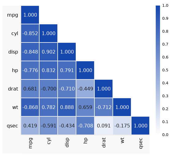
To view the example, open the dataset in DataClassroom and go to the left-hand menu Advanced->Correlation Matrix option.
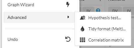
Selecting a correlation test
You can choose between the following correlation coefficients:
- Spearman (rho) (default) - this evaluates whether the relationship between the variables is monotonic (if one goes up, does the other) even if not a linear relationship.
- Pearson (r) - evaluates how close to linear the relationship is between the variables.
Spearman is especially relevant where you have survey data including opinions expressed on a numerical scale (e.g. "how happy do you feel on a scale of 1-10?") where the scale is effectively arbitrary and can vary from subject to subject, and you are interested in the correlation with other variables which also have arbitrary scales.
Selecting columns of data
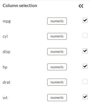
You can select which (numeric) columns are to be included in the matrix, using the column selector on the left. You can hide the column selector when you are done with it.
Exporting image and data
The camera and copy tools let you copy the matrix as an image, or copy the numerical contents as a table suitable for pasting into a spreadsheet:  The image resolution obtained from the camera is related to the actual size of the image on your screen. To get a high-resolution image for a poster:
- Make your browser window as large as possible
- Hide the column selector on the left so as much of the screen as possible is available for the width of the matrix
- Make sure the Autosize option under Customize Appearance is checked to ensure the full width is being used
Customizing the appearance

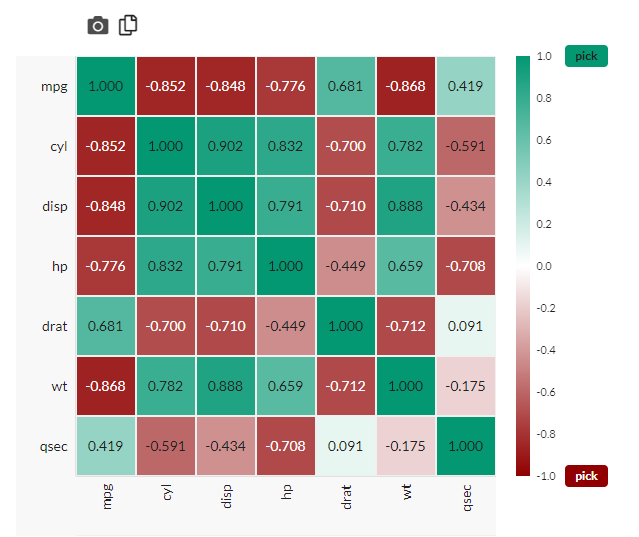
You can also customize the appearance in several ways. You can use the Customize Appearance button and:
- Change the color used (in the example below, green has been selected instead of blue).
- Fill the entire matrix, instead of just the bottom-left quadrant.
- Color negative values differently.
- Hide or show the color scale indicator.
- Adjust the matrix heading sizes if you have especially long or short variable names.
Adding P-values
Under Customize Appearance there is also the option to add P-values for each comparison.

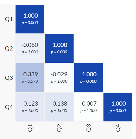
By default, the P-values shown have been corrected for the multiple comparisons problem using a Bonferroni correction.
To explain:
When doing N simultaneous correlations in a matrix there is a higher chance of seeing a significant result in one of the tests, just due to randomness.
For example, if you have a matrix with 5 variables, then you are doing 10 different correlations, as there are 10 ways (4 + 3 + 2 + 1) to combine the 5 variables. This means that instead of a P-value of 0.05 having a 5% chance of appearing by random chance alone, that chance is now much higher.
The Bonferroni correction is very simple - it just multiplies each P-value by the number of correlations (10 in this case).