Let's say you are running an experiment to see how light affects plant growth. You will expose plants to either light or dark environments, and measure their growth after a week. You have three volunteers, Ali, Beth and Cy who will each manage a pair of plants. So six plants in all. Back to overview...
Entering your results like this:
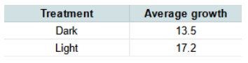
This is a very traditional way to enter such results for graphing - it's simple, and can result in a bar chart of these average (mean) values like this:
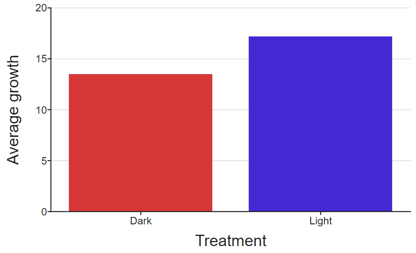
However, it has some disadvantages:
- There is no indication of how results were distributed by volunteer. Maybe this also has an effect, but you can't see it.
- By already calculating the averages, you can't see a view of how all the results were distributed.
- You can't do any form of statistical analysis on this data
DataClassroom can do a lot of the work for you, calculating averages and displaying graphs with many points.
We'd recommend that you record your data as one observation per row in a table, with columns that show the characteristics of each observation (your variables).
See here for an explanation.